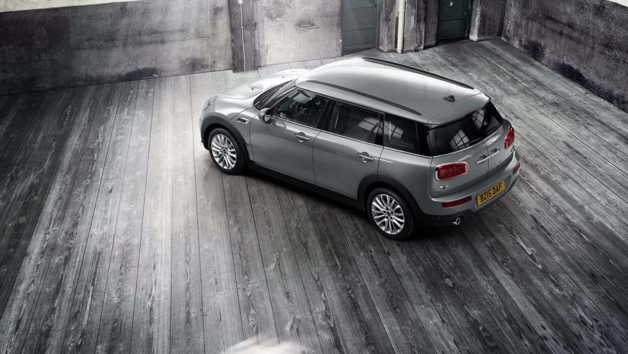
The BMW Group unveiled the MINI brand’s new product and brand strategy at the MINI Clubman world premiere yesterday in Berlin. Design, authenticity and long-term value define the new brand image, which will initially be seen in a newly-designed logo, new font and new visuals. The brand will also explore new approaches to communications in the launch campaign for the new MINI Clubman.
Sebastian Mackensen, head of MINI, emphasised: “Since its creation in 1959, the MINI brand has always stood for ideas, inspiration and passion. We want to continue the MINI success story and have refined our brand strategy and refreshed the brand’s visual identity – starting with the campaign for the new MINI Clubman. We aim to make more people avid MINI fans – with a new brand identity and new offerings in the future.”
Brand strategy
The global relaunch will take MINI into a new era and, at the same time, build on the brand’s tradition of reinventing itself to shape the spirit of the times. The relaunch unveiled yesterday represents the most significant leap in brand identity since 2001, with a new corporate design effective immediately. The central idea is the combination of clear, emotionally-appealing design with a focus on the essential. The motivation of Sir Alec Issigonis, the creator of the MINI, was to build a small, economical city car that took up as little space and used as little petrol as possible. His clever solutions for optimising space gave the original Mini its unmistakeable design; his friend, John Cooper, recognised MINI’s race car potential. The collaboration between the two created a unique dynamic between the brand’s focus on the essential and highly-emotional driving fun, and is also to thank for its iconic MINI design.
The new brand philosophy eliminates all that is not essential to make room for what matters most. It focuses attention on core messages and authentic communications. The new logo, new typography and new tonality are based on the principles of clarity and authenticity – and reinterpret the brand’s DNA to allow it to shape the spirit of the times in the future.
MINI logo and font
I guess the only cue they got from the tech companies lately is a move from 3D design to a flat UI. A “flat design” 2D logo has been developed from the existing 3D logo for high recognition value: The logo stands for itself, with no imitation of material or shape. This minimalistic approach stands out visually and can be used in all sizes and formats.
The new MINI Serif font also reinforces the new brand image. It was developed from a typeface manually-set by Swiss designers used in publishing and given a modern cut. MINI Serif reflects the brand’s strong design orientation, underscores its quality and benefits from the contrast between tradition and modernity. The new MINI font is geared towards the user, easy to read and gives content the room it needs.
https://www.youtube.com/watch?v=tVp–2vdaow
New CI and visuals
The entire CI serves as a platform for showcasing content – allowing products to speak for themselves. The visual identity reinforces the concentration on five strong core models as previously announced. Separate visuals and wording were developed for each of these models to highlight the individual character of each – but with their family membership still recognisable. The first of these worlds will be visible in the campaign for the new MINI Clubman.
Other posts by AF Newsdesk


