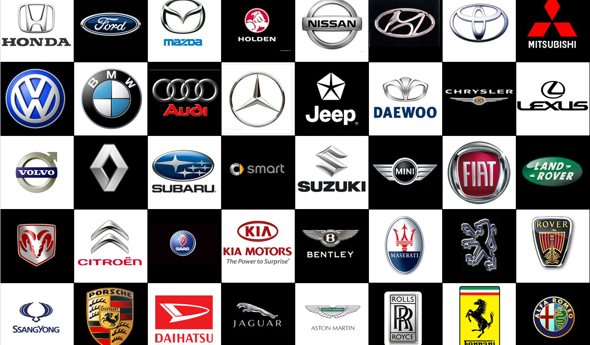
Similar to a pesticide commercial warning on radio, this is a parody and not to be taken seriously. Having owned 90% of the brands below, I recently decided to decipher what they actually mean from my POV, so in no particular order, here we go…

BMW – Unbeknownst to many, the letters in the BMW logo stand for Broke My Wallet. Yes indeed, if you’re not careful, (like me) restoring and maintaining an old BMW can indeed bring forth the true meaning of the blue-and-white bits of the logo too. They depict the flashing lights of an ambulance which you’ll be in, after the repair bill for the car gives you a friggin’ heart-attack.

ALFA ROMEO – The most honest logo of all, the cross depicts a hospital where you will be admitted for either almost burning to death in one, or for the various cuts and bruises you might have gotten jumping out of a second story window when your mechanic calls for the seventh time in one week, to tell you something else is wrong with the car. As for the serpent eating the man; you’re the man, the serpent is your workshop… apt.

SKODA – A very interesting logo this, it’s an arrow in a bird. I’ve surmised that it’s a Dodo, a dimwitted flight-less creature being killed by an arrow, and it’s extinct. Kinda like the Skoda brand too.

MERCEDES-BENZ – The famed three-pointed star denotes dominance in Earth, Sea and Air, however, having been heavily involved with the restoration processes of many early pre-eighties models, for those cars the three-points likely stand for Home, Workshop and Scrapyard…in that order.
 CITROEN – Double-helix or double-trouble? Funny that both point toward heaven, one might denote your eventual final-destination, while the other seems to be pushing you there. Make no mistake, buy one and it’s for life. Till. You. Croak. Wanna see a grown man cry? Ask him to sell his new Citroen after a year… death by depreciation anyone?

VOLVO – Ah, the “sex-symbol”. Ironic given that Volvo’s were never sexy, right up to the mid-90’s post-C70 era anyway. It’s a symbol of masculinity as well, but unbeknownst to many the arrow on its older models is actually pointing you to the nearest workshop.

AUDI – The four rings (and a funeral?) represent the companies responsible for bringing forth the brand, today they represent how many rings you’ll get from the service centre, in one visit… four times the suffeRing perhaps?

LEXUS – A simple logo, a large ‘L‘ within a circle. It’s basically telling everyone in front and behind what a loser they are for not buying a Lexus, because let’s face it, Lexus cars are awesome.

OPEL – The perfect logo to end this nonsensical article, it symbolizes a lightning-bolt, which personifies the brand in this country perfectly. Came in like a flash, made a lot of noise and then disappeared very quickly…
Now if you want to know the real, true meaning behind these and a few other car logos, have a look at this video from Car Throttle..
Other posts by Chris Wee


