From the perspective of Naota Fukasawa:
As a child, I often had the task of peeling potatoes, and I could never get rid of every last trace of soil on them. No matter how hard I tried, the potatoes were always still a little dirty. But as soon as I immersed them in water, they were clean—and suddenly became sculptures that fit beautifully in my hand. That’s something I have never forgotten. Decades later, when designing a cell phone, I pictured users reaching for it in their pockets. That reminded me of my experience with potatoes, so I deliberately chose not to draw aerodynamic lines. Our hands instinctively seek edges; they want to feel textures, to play with them or use them for orientation. Cars are no different in this respect, even though we use our eyes instead of our hands to constantly trace their lines and edges. It’s our way of playing with what is beautiful.
The world of design has changed dramatically. Graphics, products, interior decoration, sound, film, and art influence one another all the time. We live in a world of walls. Between us and the walls are objects that we have created. The current trend is for these objects to wander, either toward the walls or toward us. The bulky television sets of the past have been replaced by flat screens that we hang on the walls. In contrast, those heavy old phones have migrated toward us and now nestle in our hands. Audio systems? They’ve moved either to the walls or to our ears. Lights, air-conditioning systems, refrigerators—they’ve moved closer to the walls than ever before. Our world is becoming cleaner, tidier, and more streamlined. That is a key aspect of the work of a designer. There are, of course, quintessential objects like tables, chairs, pots, and plates that will continue to be what they always were. A car will always remain a quintessential object. And the form of a Porsche is something like a quintessential form: beautifully ordered from the start, streamlined, and flawless. An oasis of beauty for our eyes in an overwhelming world.

Harmonious overall picture
The term “interface” used to refer to software and screens. Today, every successful product is an interface—a hinge, so to speak, between people and the environment. Cars have long had this quality, thanks to their clear purpose. As a designer, I spend my time observing our everyday lives. It’s the only way I can come up with the right results and find the forms that live in the culture, habits, memories, and histories that connect us. What I’m looking for are whimsical moments in urban life that arise as if by chance. They give me insight into human behavior. And I use them to develop products. For example, if someone doesn’t have a doorstop, they might use a rubber boot instead. This is a perfect impromptu solution—the door won’t close and the rubber will protect the wood. So why not create doorstops that look like boots? Another example: a woman stands at an intersection holding a shopping bag and an umbrella. The rain has stopped, so she leans on the umbrella and hangs the bag on the umbrella’s handle, but it slips off. That gave me the idea of making an umbrella with a groove in its handle. People carry solutions like these around with them all the time without giving them a thought. That’s why they often tell me they’ve seen my designs somewhere before. They haven’t, of course; I tell them they’ve just rediscovered them in my work.
Once, I saw a girl sitting on a fallen tree trunk, utterly absorbed in reading a book. I thought to myself, “Wow! If this girl can be so comfortable, I should design a bench that looks like a tree trunk.” And this piece of furniture was indeed a success—although not as much as my CD player for the Muji company. It hangs on the wall like a ventilation system. You turn it on by pulling a cord. The CD spins like the blades of a fan, but emits music instead of air. That’s a perfect interface. The design blends into our world of experience, playing with associations like a clock, a shoelace, and a fan. It’s humorous and, of course, functional.
The rear determines the character of the car
If you spend too much time too close to an object, you won’t see its context and won’t come up with a practical solution. I’m not the type of product designer who starts by sitting down at a table and sketching, who plays with shapes, surfaces, and colors in an attempt to create the best possible result—divorced from the outside world and oblivious to its connections. If you work like this, you’re not really in the world.
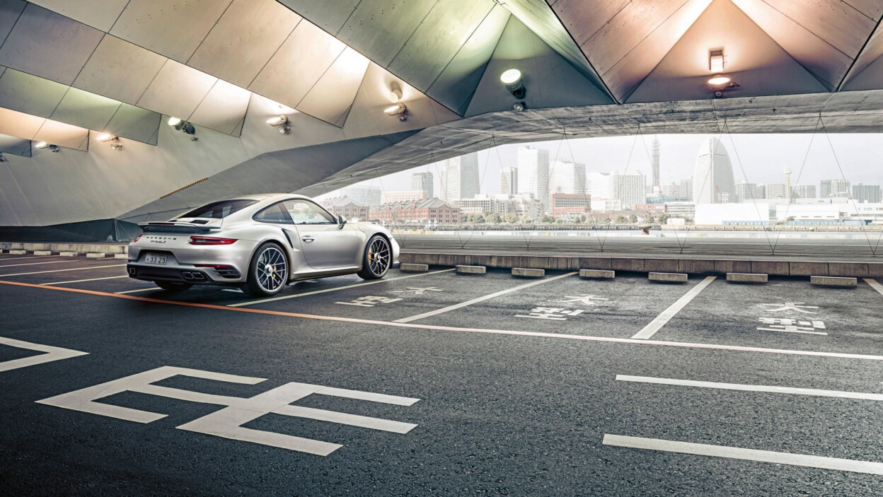
Imagine a puzzle: you’ve got a hundred individual parts that represent the product’s environment. But the last piece is missing: the product itself. If you study all of the pieces of the puzzle, you’ll eventually find a shape that fits in perfectly with all of the others. But if you ignore all of the others while you sketch the last fragment, how can it possibly fit into the overall picture? The harmony would be destroyed. Something similar happens with a sports car. Its purpose is acceleration, which is why all of its lines reflect its form and come together at the rear. A Porsche and its characteristic contours yield a rear that is as natural as the last piece of a puzzle fitting perfectly into the overall picture. The front of a car might be its face – but the rear determines its character.
Other posts by Mark Leo

